Project
Giya
Giya is a bill-splitting app for friends, flatmates and travel groups. It keeps the running balance for every person and group, so nobody has to work out who owes what in a spreadsheet or a group chat.
We designed the brand, the dark mobile app and the marketing website that explains it in one scroll, and we built the website.
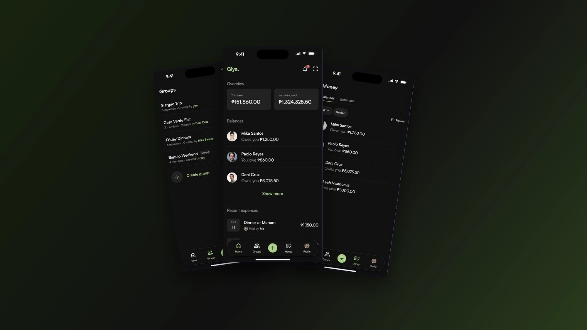
What we did
- Brand identity
- Mobile app design
- Web design
- Web development
Platforms
- Mobile app
- Website
Tools
- Figma
Overview
Split bills without the awkward math.
Challenge
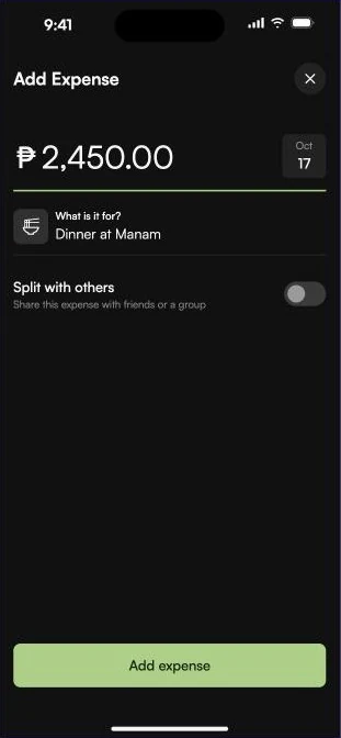
Splitting a dinner, a trip or a flat's bills usually ends in a spreadsheet or an awkward message. Giya keeps the running balance for you: add an expense, choose who is in, and the app does the math.
Approach
We designed the brand, the mobile app and the website, and built the website that brings people in.
01 / Website
A site that explains it in one scroll
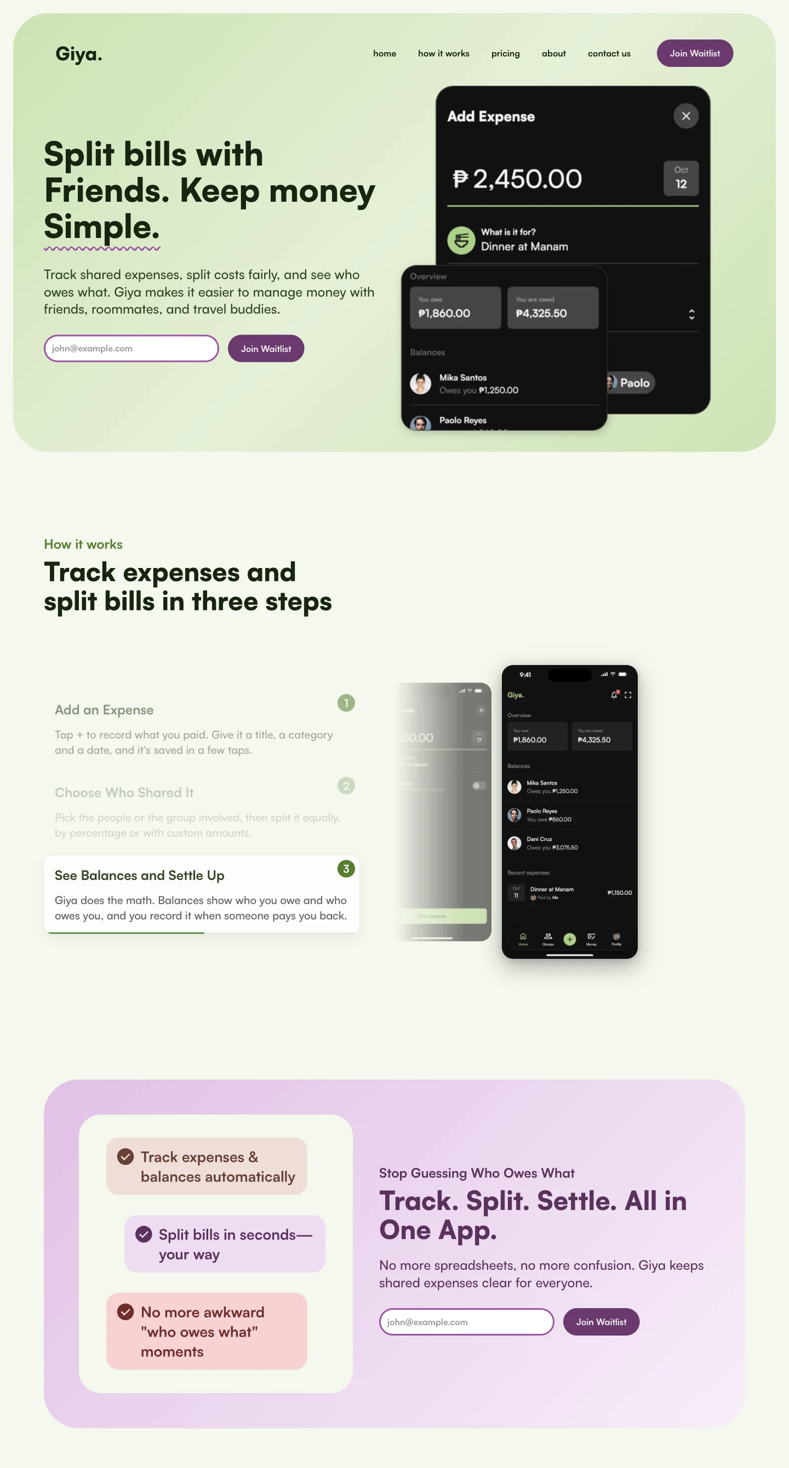
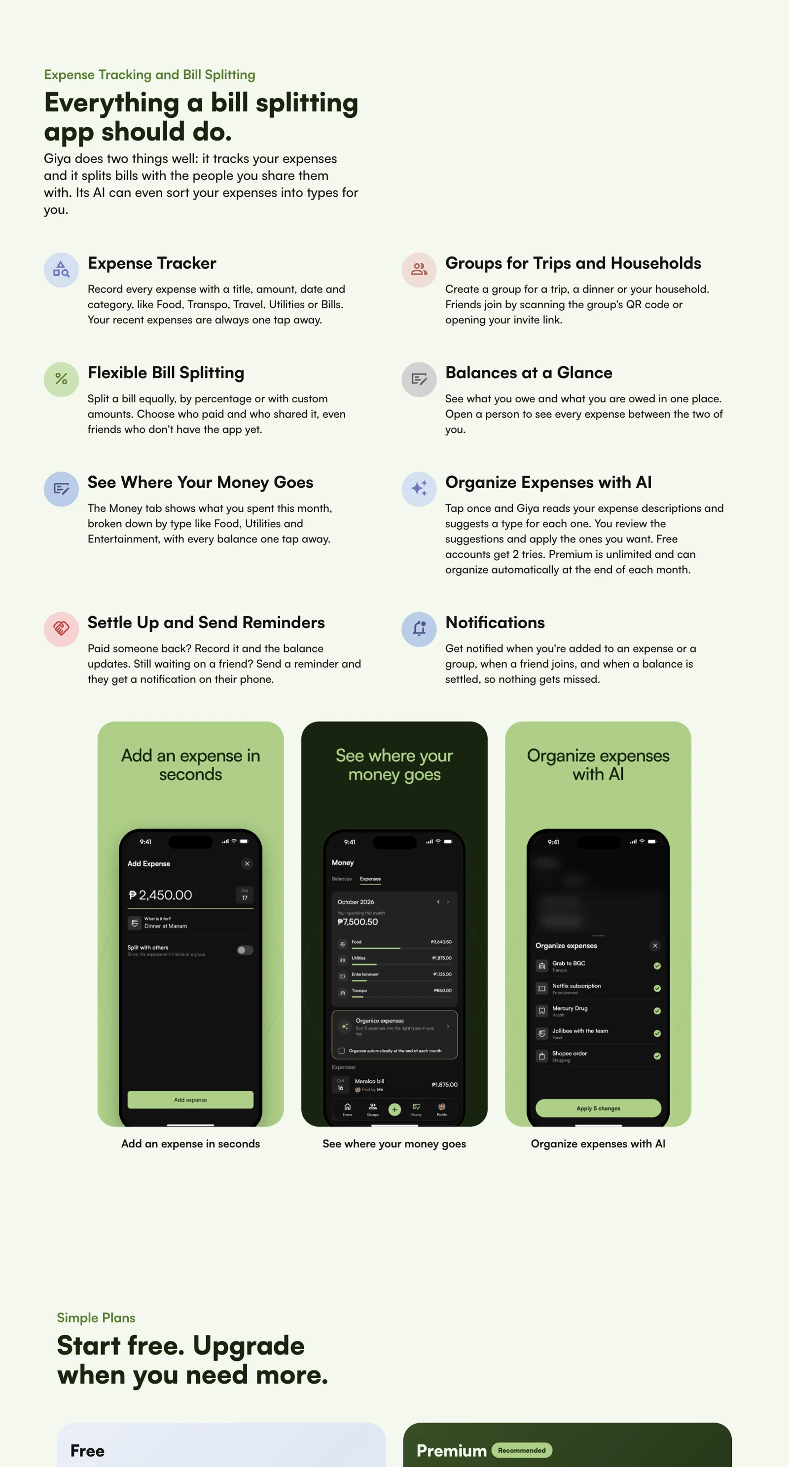
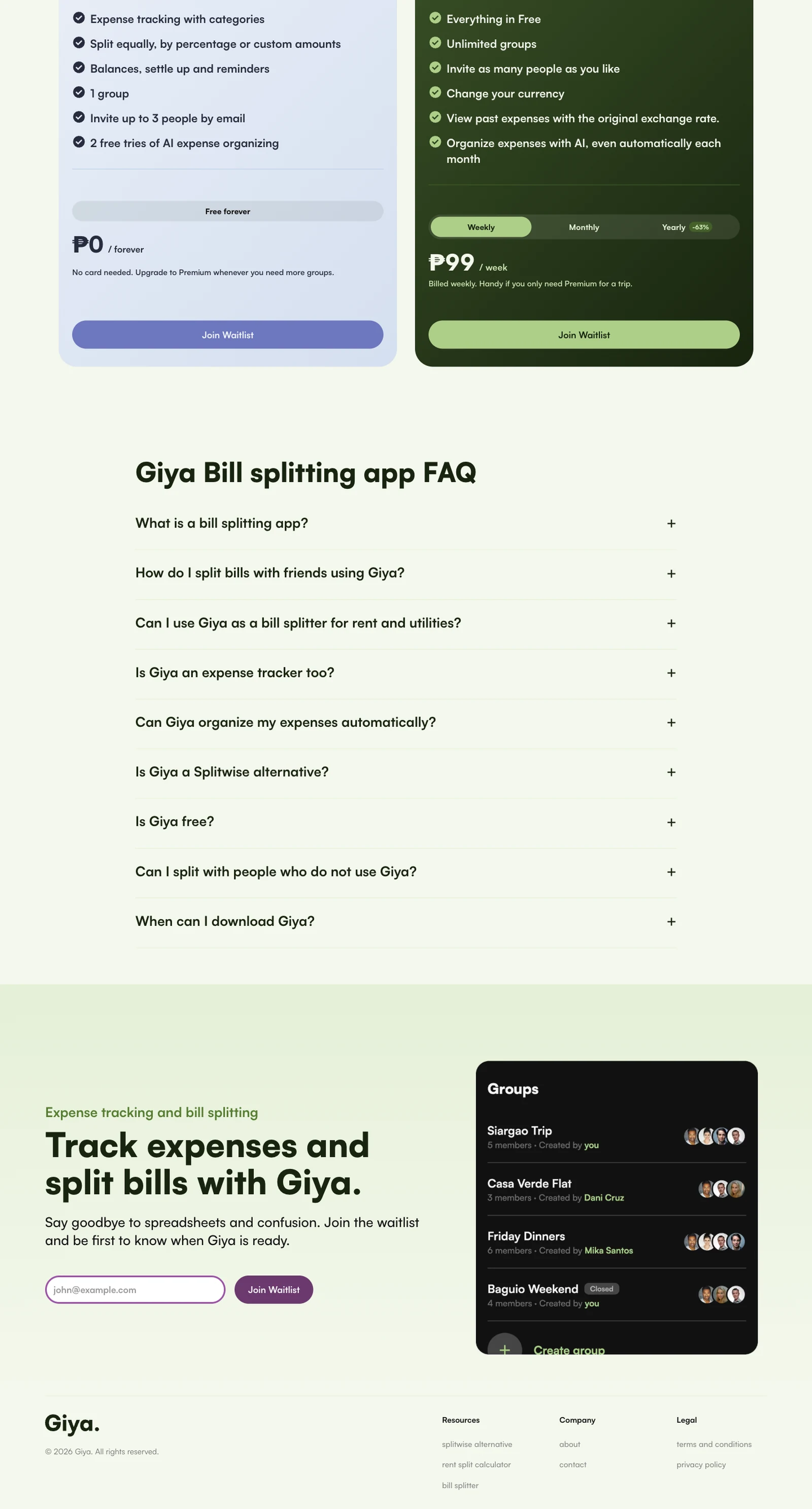
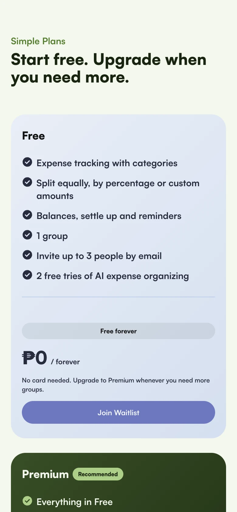
The website sells one idea: tracking and splitting expenses should be simple. The hero shows the app doing it, a three-step section explains how it works, real user stories build trust, and plans are laid out plainly at the end.
Scroll this page and the website scrolls inside the browser, from the first headline to the footer.
02 / Design system
Green on dark, pastels on light
Giya has one accent, a fresh green, and it does the same job everywhere: it marks the main action on the dark app surfaces and sits behind the headline on the light website. Warm pastels and a plum button give the website its softer side.
Everything is set in Satoshi, in a few clear sizes.
Giya green / The accent for every action, on dark and light
App surfaces / Dark first, in layers
Website pastels / Warm tints for cards, plus a plum for the main button
Typeface / Satoshi
Satoshi / Brand, website and app
ABCDEFGHIJKLMNOPQRSTUVWXYZ
abcdefghijklmnopqrstuvwxyz
0123456789
Buttons
03 / Mobile app
The app, in dark mode
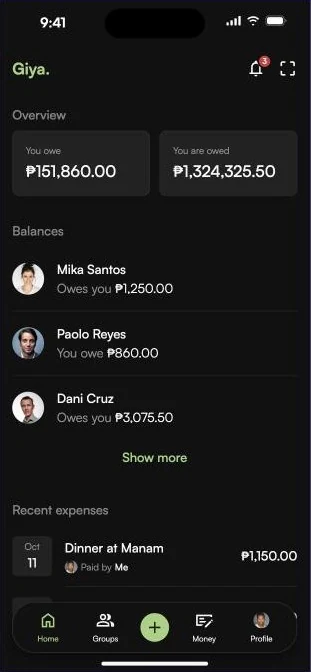
The latest design is dark first, with a single green accent for actions. The home screen answers the only question that matters, who owes whom, in two numbers and a short list of people.
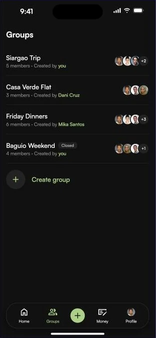
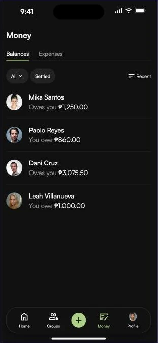
Groups keep trips and households separate. Money shows balances and, for premium users, monthly spending by category. Premium is a clear upgrade screen with weekly, monthly and yearly plans.
App
01 / AppHome
02 / AppGroups
03 / AppBalances
04 / AppAdd an expense
05 / AppExpense details
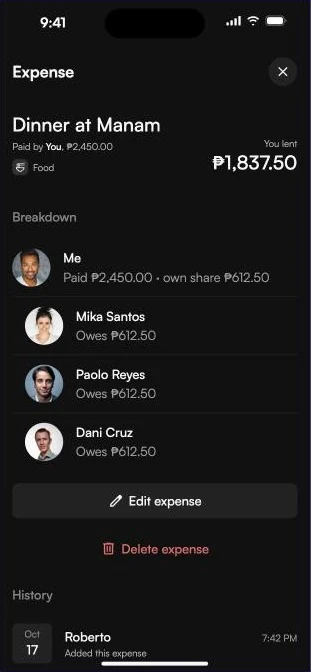
06 / AppPremium
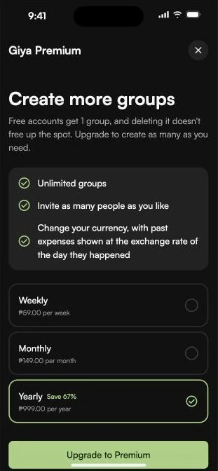
04 / Responsive
The same story on a phone
On a phone the website becomes one column: the headline and waitlist form first, then the three steps, features and plans, each readable without zooming.
Website on a phone
01 / Website on a phoneHero and waitlist
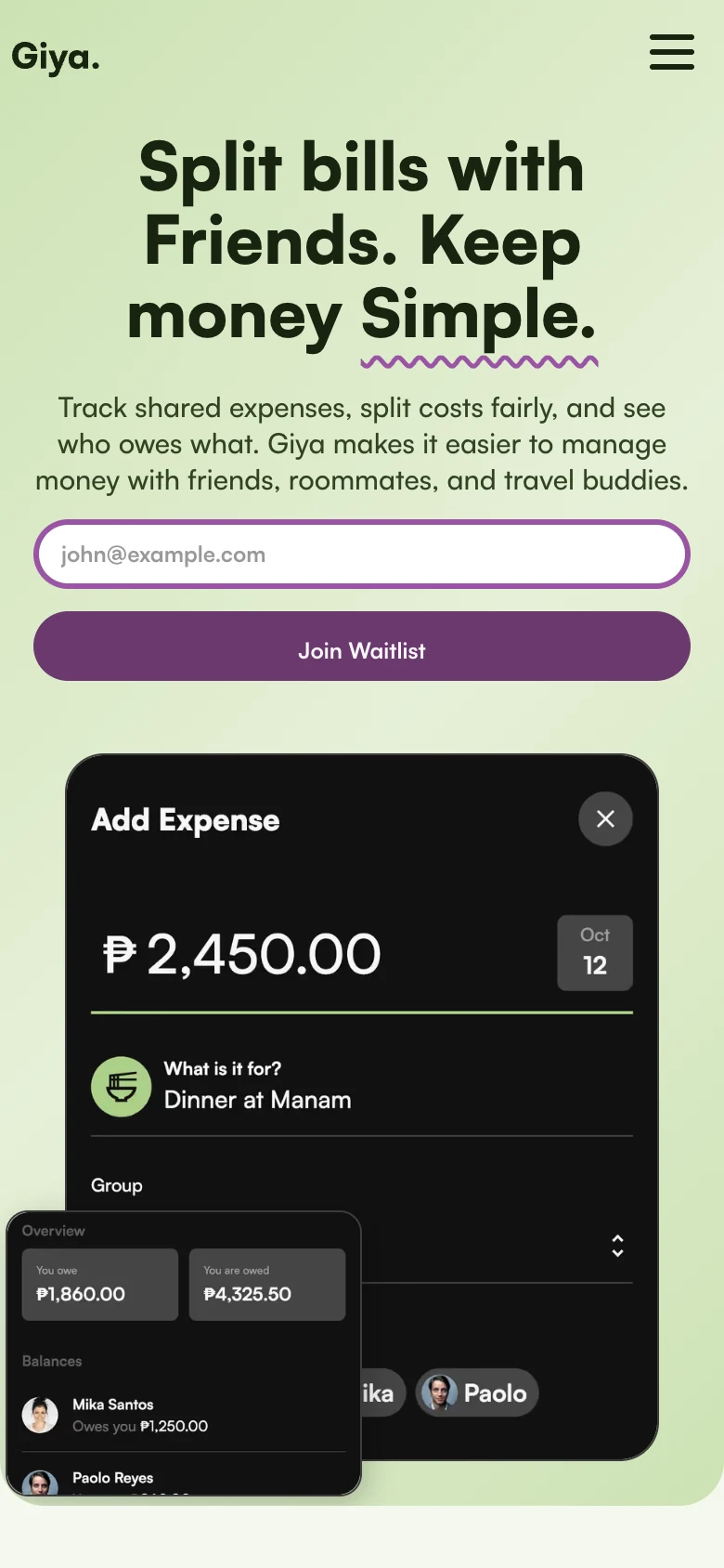
02 / Website on a phoneHow it works
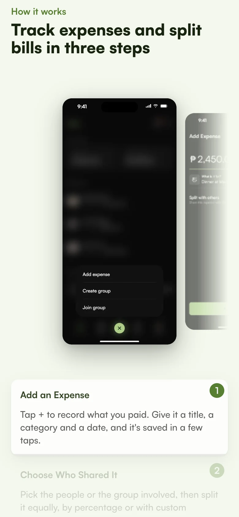
03 / Website on a phonePlans
Your project
Have something like this in mind? Tell us what you are building and we will reply with a plan and a price range.